No products in the cart.

Choosing the right color scheme is one of the most important decisions you need to make when customizing your packaging. If the actual printed color doesn’t match your intended color, it can damage your brand recognition and increase production time and costs. This guide will explain what CMYK and Pantone colors are, what the difference are, and how to choose the color that’s right for you.
What is CMYK and Pantone Color?
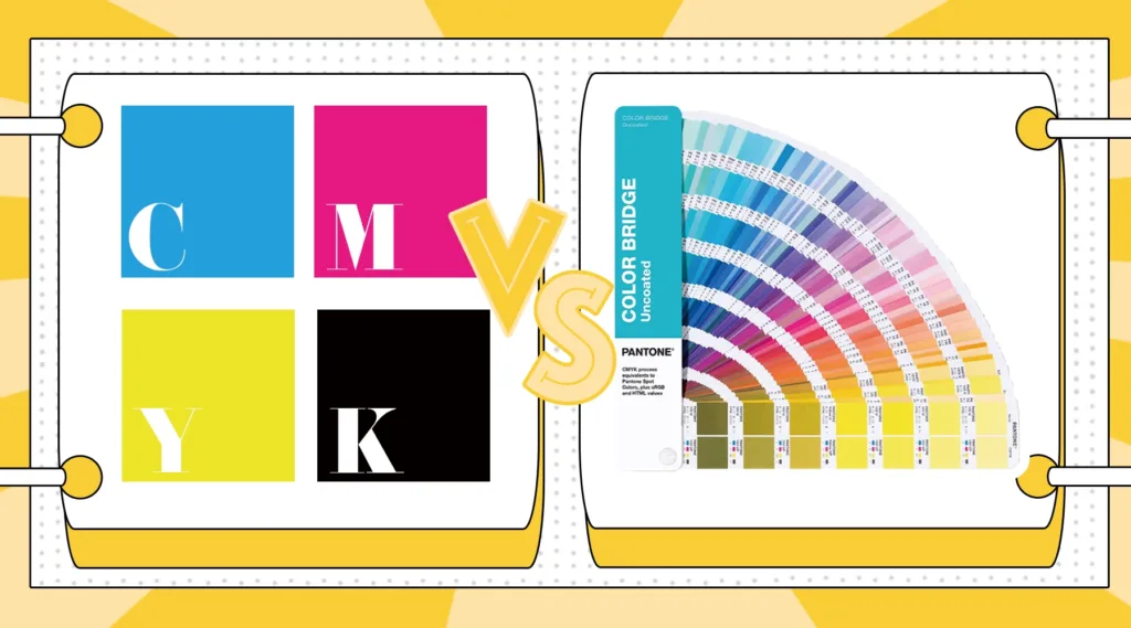
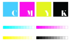
CMYK color is composed of cyan, magenta, yellow and key(black). It’s a color system used for full-color printing. Printers or printing machines combine and mix these four colors in varying proportions to create rich, colorful printed images.
Pantone color refers to the Pantone color matching system, a standardized library of pre-mixed, precisely formulated inks. Each Pantone color has a unique code, representing a single, pure color, rather than a color constructed from the four CMYK color plates. Printers mix the ink corresponding to the code to create the specified color. Most printers typically purchase pre-mixed spot colors for direct printing. Pantone colors are a universal language for expressing color in the printing industry.

Main Difference Between CMYK and Pantone Colors
How color is produced: CMYK is produced by mixing four inks during the printing process, while Pantone uses pre-mixed inks. Furthermore, Pantone colors are consistent across different production batches and suppliers, meaning there is no color variation.
Color gamut: Pantone colors include colors outside the CMYK color gamut, especially very bright fluorescent colors, extremely saturated colors, and metallic colors. These colors are impossible to achieve with CMYK. However, CMYK can mix millions of colors by combining four color palettes.
Color difference and brand consistency: Because Pantone inks are fixed and standardized, they provide consistent printing results. They don’t vary across different printing presses, substrates, or print batches. This makes them ideal for clients who require precise brand colors. The printing effect of CMYK will vary depending on the printing press, ink mixing ratio and printing medium, so it is very difficult to maintain color consistency between different production batches and different suppliers.
Cost: Pantone colors are expensive, and each additional spot color ink adds a fee, sometimes also increasing the cost of the printing plate. For print jobs with rich colors and complex, dense patterns, using CMYK is generally more economical. For print jobs that include multiple Pantone colors, using multiple Pantone inks can be expensive.
When to choose CMYK and when to choose Pantone
Choose CMYK:
- When your design contains gradient colors, uses a lot of photos, and has complex and varied colors.
- When the budget is tight and you want to produce your packaging in the most economical way possible.
- When using digital printing.
Choose Pantone:
- When you need to use a certain color accurately and repeatedly in different printing batches, different printing media, and different suppliers, Pantone colors have unique codes, so you can print this color accurately.
- When you need metallic, fluorescent, and other highly saturated colors outside the CMYK color gamut.
How to make the final decision?
- Observe the color elementsin the design and determine which are brand colors, logo colors, background colors, and which are images that can be flexibly adjusted. Pantone colors are recommended for brand colors, logo colors, and large-area background colors.
- Check the file type.If it’s photography or portraits, CMYK is the preferred choice. For flat graphics or backgrounds or logos, Pantone colors are more suitable.
- Confirm the printing medium and printing process.Different media, such as kraft paper, plastic, and cardboard, will display different colors. Also, be sure to clarify the printing method used and whether it supports spot color printing.
- Use physical Pantone color bookinstead of viewing colors electronically. Different screens display colors differently. Choose Pantone colors from physical color book so both you and your supplier see the same color.
- Consider your budget and order quantity.For large-volume print orders where brand consistency is essential, the unit cost of using spot colors is often very reasonable and acceptable. For smaller print runs, CMYK is more economical.
Quick decision summary:
- If your packaging includes rich full-color images or photos, or if your budget is limited, choose CMYK.
- If you need precise brand colors, special fluorescent/metallic colors, or need to order in different batches and materials, choose Pantone colors.
- If you need both, use CMYK for complex, full-color images, and Pantone for branding or logo colors.